WYSIWYG Drag and Drop Interaction Design

What is this project about?
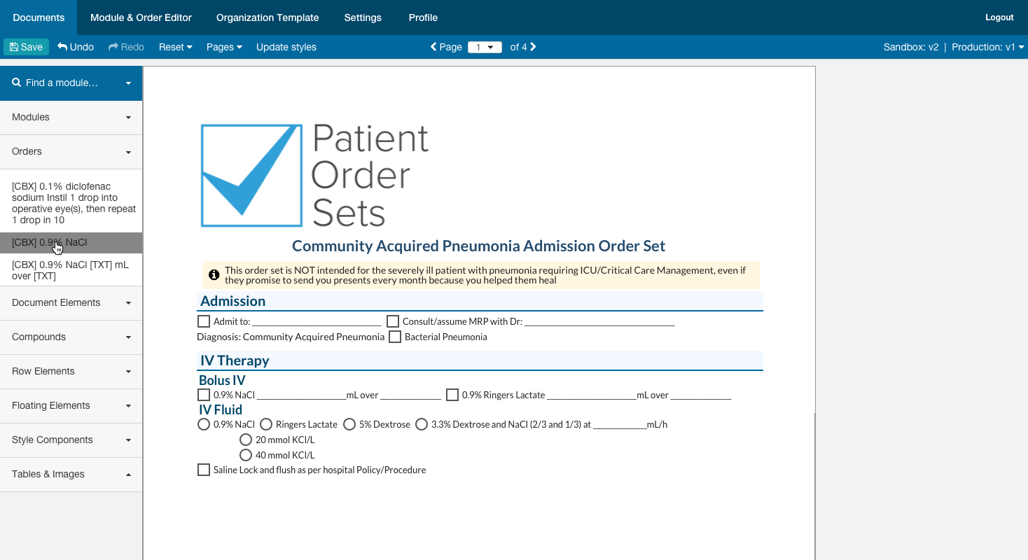
Form Designer is an internal application used by document developers at Think Research to build digital forms used by clinical staff in Acute Care. As the primary designer on this project, I was tasked with designing drag and drop interactions within this WYSIWYG form builder.
Background
For years, Think Research has been a provider or clinical content to hospitals around the globe. Order Sets began as a diagnose based set of clinical documents that clinicians could print out and fill by hand. As the need for digital documentation and data collection arose, Form Designer was created to assist our internal teams with digitizing these Order Sets.
The Overarching Problem
The Form Designer application includes an existing library of drag and drop elements that can be laid out to create a digital form. Creating these forms is time consuming, and there is no visual indicator or interaction to give DDs insight into where they may drop an element and what will occur when they drop it. Documents are often 5-30 pages long, and could take days to complete a build.
How might we provide drag and drop interactions that help DDs understand where they can drop library components, and how library components can be combined?
Hypothesis: Providing drag and drop interactions for the form builder will reduce form building time from 6 hours per page to 3 hours per page.
Note: The initial time estimate on average hours per page were measured by the Document Development team at the outset of this project.
Requirements
In order to facilitate drag and drop, users should:
-
Have a standard, custom drag preview for all elements that does not obscure the layout when dragging
- Be able to preview the document appearance and understand of the outcome of their action
- See gradual transitions where drop zones and elements appear and disappear
- An indicator on the newly dropped element to help them visualize where the layout has changed
-
Seamless transitions
- fade in/out
- drop zone collapse/expand
- sibling movement within document
Designs
Library - Drag Preview
The first step was to provide the user with an indicator that they have picked up a drag and drop element from the library. Elements in the drag and drop library primarily consist of text, and are different sizes. It is important to provide the user with a consistent indicator of the dragged element.
- Initial designs provide a consistently sized indicator
- User's mouse cursor should be locked to the top left corner of the drag preview element, to provide a consistent drop experience
- Future considerations involve exactly representing the dragged element to providing an accurate representation of what the layout will look like when dropped.
Drag and Drop library - Picking up an element
Drag Preview Visualization
Drop Zones
Due to the complex nature of the documents, elements can be combined in a number of ways. I began by interviewing users to understand how they might build Order Sets. I workshopped together with the DDs and clinical staff using component cut-outs to manually 'drag and drop' elements. This workshop allowed us to define all of the possible drag and drop scenarios, and understand where element drop zones might need to be made available:
- Drag into container
- Drag to left, right of element
- Drag above, below element
- Drag to combine elements, including drag between
- Drag an element as a child of another element
As I worked with stakeholders, I gained a clearer understanding of their needs. In addition to where they might drag, concepts began to emerge about indicating when a target has been reached. Not only should we show where an element might be dropped in relation to the hover location, but it was also important to users to understand when they could drop.
Drag into container
Users can drag onto the full page or into a container. As they do so, the entire container is given a 'positive drop zone' indicator, helping the user understand that they can drop their dragged element. When dropped, the element will be populated at the bottom of the container.
Drag onto page

Drag into container

Drop zones and Drop Zone Targets
Users expressed the need to visualize possible drop zones to targets, as well as a target that was active - indicating if they released their mouse, where their dragged element would land in the layout.
Drop zones
Drop zone indicators, consisting of a bar with pips at either end, served as indicators that a potential drop zone existed. In this view, we can see that the dragged element could be dropped to the left, the right, above or below the hovered element.

Drop Zone Targets
I needed to differentiate a drop zone target from an active drop zone, as well as provide the user a visual indicator of how the layout may change. In order to do this, I created interactions when the user hovers a drop zone bar, that the bar opens up and changes state to indicate where the element will be dropped.
Drop left and above examples


Combining elements
Another aspect of building these digital forms was the need to combine elements together. For example, form elements can be combined in any number of ways and for this reason are broken up into individual atoms like radio buttons, labels, text inputs, and dropdowns. I needed a different visual interaction to help the user understand additive drag and drop, which would combine their dragged component with elements already in the layout to create a compound.
Radio and Textbox
When hovering an element that can be combined with other elements, the user will now see a differently styled drop zone. Instead of a bar indicator, an additive drop zone indicator appears in the layout, and a border indicator is displayed around the entire element to demonstrate that these two will be combined. Elements can be combined by dragging a new component at the end, middle or beginning.
In the example below, the user is dragging a text box into the layout and combining it with a radio button to create a compound. When the user hovers the additive drop zone, a familiar interaction should show the drop zone target expanding to indicate the element can successfully be dropped.


Dragging into the middle of a compound

Developed Feature
Outcomes
When the feature was released, we relied on metrics to measure the improved speed of form building. At the outset, it took Document Developers an average of 6 hours per page to build a document. For documents of up to 30 pages, this meant it could take up to 8 business days to complete a build for an extremely long form.
The first measurement took place two weeks after the release of the feature, and resulted in a reduction in average build time per page from 6 hours to 4. As the DDs spent more time getting used to the new interactions, a second measurement was taken at the 4-week mark. At this point, the DDs were highly proficient with the released feature, and on average could build a page in 2-2.5 hours!
Final result
66.67% decrease in average time to build a page with the new feature.