React Storybook Design System
Intro
At Think Research, I spearheaded the creation of a design system for our entire product design team to use in Sketch. I spent time working with our team to understand what assets they needed to work on designs in a consistent and speedy manner. This was an invaluable learning experience, and I continue to evolve this style guide to keep up with additional functionality added to Sketch, and to ensure designers have the components they need.
As I shifted to a new product team and began designing this application from the ground up, my goal was to evolve our design system so that it helped both designers and developers.
Research
While working on design system components in Sketch to facilitate my own work designing this latest product, I collaborated with engineers on my team to understand what design system framework could speed up their workflow, while providing them with reusable and consistent components to use in our application.
In addition, I spent time reading about Atomic Design and learned more about how other teams were creating and evolving their own design systems. I reviewed other design systems for inspiration to understand more about organization and hierarchy.
React Storybook
After discussing the options with the entire product team and engineers, we decided to use React Storybook as our design system platform. Since the team was working with React, using this tool made a great deal of sense. In addition, the team was excited to work with Styled Components for React, and loved the speed at which the design system could be set up to begin building out usable components for our code.
Our teams loved:
- Open Source
- Components can be built and tested in isolation
- Components are organized and efficient to code, find, and use
- Use of Styled components and Design Tokens that can link to our UX team's Sketch files
The Pitch
In order for our teams to be able to begin using Storybook, it was important to pitch this shift to the VP of Engineering. I created a deck to educate designers, developers and Engineering management so that we could properly vet Storybook for use on the new product. I presented this deck to the entire engineering department and solicited questions and feedback from all teams.
It was important for me to communicate the benefits our teams would receive for the effort they needed to put in:
- A library of reusable components - build once, use many times; Consistent component code can be used in many instances
- Build components in isolation without affecting production code so we can test edge cases and hard to reach states
- Create visual use cases in Storybook via Stories that can be used by Sales teams, Product Management, and more!
- Designers and QA can utilize Storybook to ensure developed features look and function as expected before deployment
- Code snapshot tests allow development teams to see code regressions right away
- Quickly find, visualize and test all components in the app
- Storybook becomes a communication tool for designers and developers to collaborate and give/receive feedback while development is in progress
- Quick and easy to install; Reduce re-work as the design system grows!

The feedback I received was resoundingly positive, and my team was given the green light to spend time implementing Storybook and refactoring the already developed project code base.
Implementation
I began working with the developers to initiate the Storybook boilerplate and start building components. It was a pleasure to actively develop along side the engineering team, and to pair with them to build out the design system components.
Sketch Design System Components to be built in Storybook

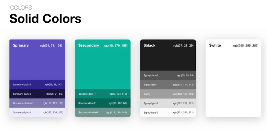

 We started out small, implementing design tokens for colours and fonts. We installed the Styled Themes Addon and started building a theme for our app. Once the building blocks were in place, we followed the atomic design footsteps and started building out the smallest components first, including buttons and inputs.
As the project grew, so did the complexity of the components we built. The developers began seeing positive results immediately. As they were handed designs, they began using and re-using already built components. Their workflow became faster and faster as we built out a larger library. When a new component was needed, the team allowed me to build out the foundation myself in the code base, and pair with them to add more complex functionality to the code.
Storybook Headings and Calendar Component Examples

Building out complex components with functionality - Modal and Forms


Evolution
Once the Storybook design system was well built out, I started looking for other opportunities to speed up team processes and improve communication and testing. Since designers and the QA team also had access to our Design System via Storybook, it was important to provide flexibility for stress testing components and testing out different states.
Our current Design System included individual stories for all states of a component, and it was time consuming to flip through all the stories to view all the states. In addition, there was no way to compare these states side-by-side. We were unable to stress test things like long labels or text dynamically populated in the app.
I investigated the possibility of using Addons in Storybook. One of the addons, Knobs, allows you to edit Stories dynamically, by changing states, modifying text and labels, and more! Our engineering team loved this idea, because it allowed them to further refactor their code, and provide flexibility to design and QA teams.
Modifying headings for stress testing with Knobs

Dynamically updating Text input label and positioning with Knobs

Minimizing stories by using Knobs to toggle functionality - Single and Multi Select Dropdowns

Our teams are continuing to research addons we can utilize, including:
- Accessibility - Test accessibility compliance
- Links - Allowing us to build out prototypes and UI flows right in storybook to facilitate Design handoffs and User Testing with real components
- Info - Add descriptions to your stories to communicate design system guidelines and rules right in Storybook
In the future, I'm looking forward to further investigating how we can create more robust links between the Product Design Team's Sketch design system and React Storybook to maintain consistency between Design and Development assets.