Data Visualization Design System

What is this project about?
Along side the applications developed for clinical staff service provided by Think Research is the ability for clients to view analytics about the usage of those applications. As the primary designer on this project, I was asked to provide improved designs and a style guide for developing visual improvements on top of a 3rd party analytics platform.
Initial research
I spent a considerable amount of time exploring the features and functionality of the application. I documented capabilities and limitations of creating dashboards and displaying data as well as taking stock of all visual properties that could be applied to data and dashboards. In addition, I examined client dashboards that already existed to understand what types of data they were interested in visualizing, and how our teams had built those dashboards.

The Problem
Because our teams were using a 3rd party application to provide clients with dashboards to review utilization statistics and adherence to best practices, the amount of customization that could be achieved was limited. In addition, there were other usability issues with the platform I endeavoured to solve, including:
- All charts must fit in a limited viewport with no scrolling; If the user's screen size was smaller the charts shrink to fit, responsively
- Chart and table titles often get truncated and need to be hovered to read
- Variable text sizes are in use across charts, making it difficult to understand hierarchy
- No restrictions on colours in use, creating a wide variability in emphasis
- No standardized style rules for charts and graphs to unify the look and feel of the displayed data
How might we create a style guide to provide a consistent look and feel of displayed data, while displaying important information on multiple screen sizes?
How might we ensure that data is easy to visualize and interpret, without creating increased cognitive load on the user?
Requirements
Create a style guide that defines the following:
- Colours that can be used for data visualization
- Fonts and typography
- Design guidelines for bar charts, double bar charts, multi bar charts, waterfall charts, line charts and pie charts
- Considerations for showing the right amount of information at the right time
- Combining charts within a dashboard
- Considerations for those who may be colour blind or have reduced vision
Secondary Research
I consulted a number of articles and publications to learn more about data visualization. I learned way more than I needed to know about data! Out of this research, I determined important considerations when designing for data visualization:
- Bar charts should be used to compare quantitative data from several categories
- Pie charts should be used to show parts of a whole
- Line charts should be used to compare values over time
- Designs must be coherent, to allow the user to properly process the information they are being presented with
Designs
Font and Colour definitions
For high contrast charts, a simplified colour palette was chosen. In order to increase readability, an open and legible font was chosen. I mapped out these definitions as I designed, to ensure a consistent visual display for all chart types.

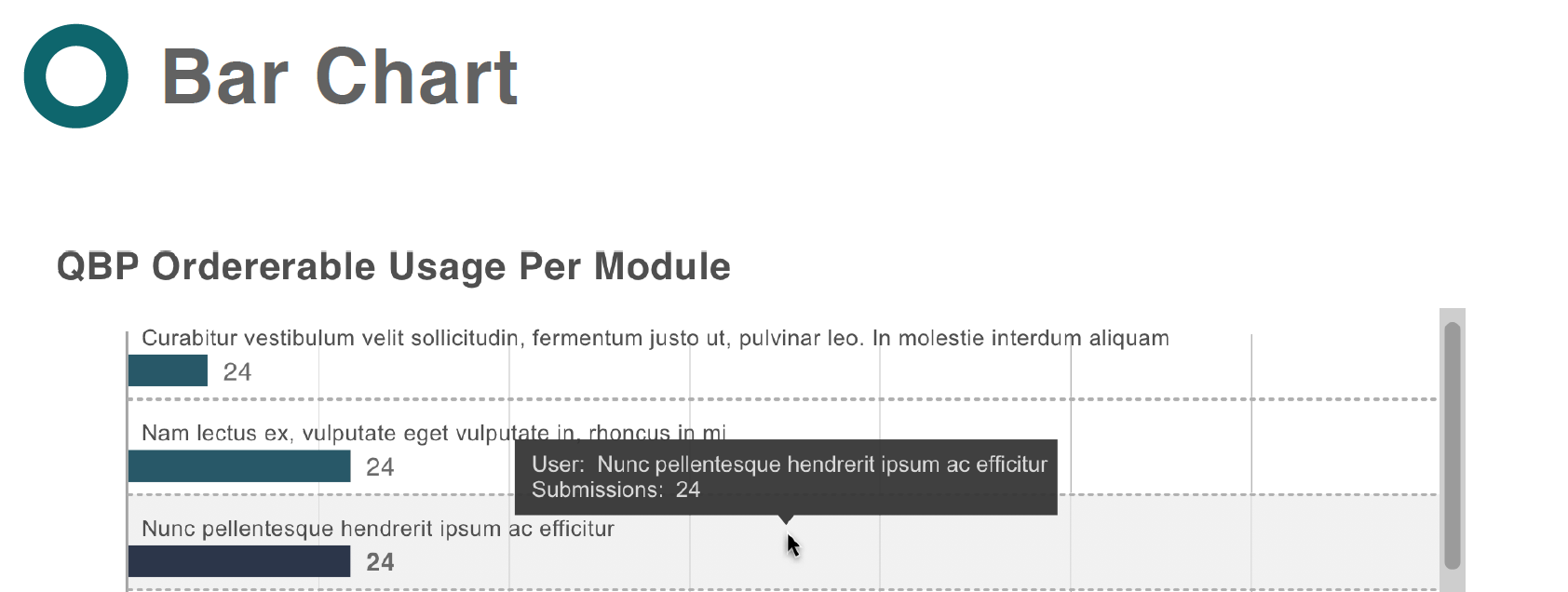
Bar charts
For bar chart visualization it was important to show a visual indicator of value and a numeric indicator. I added guidelines that defined how boundaries between data sets were styled, as well as providing a grid of vertical guidelines to assist in mapping data values properly. For double and multi-bar charts, the highest contrast colours were used from the palette, to allow for easy interpretation of data. Also defined were interaction designs, including hover states and tooltips that provide additional information in case chart labels are truncated.


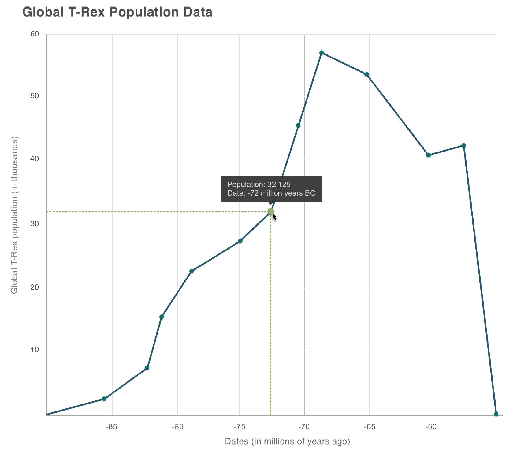
Line Chart
The line chart included a thicker line bar to better allow users to distinguish the data line from the guide lines on the x- and y-axis. Hover interactions were designed to emphasize the hovered data point on the data line. Visual reference lines to guide the user to both x- and y-axis accompanied this hover interaction. As in the previous charts, a tooltip will also display when hovering a data point.
Pie Charts
Pie charts were defined to be visualized as a ring-shape, for better use of real estate within the chart itself. To provide readability, a 1px gap has been added between pie segments. Numerical labels for each pie piece should display within the piece itself, except when the segment size does not permit. In this case, the label should display outside of the pie segment with a guide line from the segment to the label value. A tooltip will show when a user hovers a pie piece OR a label vale. When a pie piece is hovered, the style of that piece will change to include a drop shadow. Simultaneously, the label value associated with that piece will obtain a background with colour that matches the corresponding pie piece. Conversely, the same hover states should occur when a user hovers label or legend data.
