Virtual Care - Native Mobile Experience

What is this project about?
Designing a mobile experience for a virtual care web application connecting primary care providers with patients.
Background
Together with the eHealth Center for Excellence (eCE) and the System Coordinated Access program (SCA), Think Research developed an application to facilitate virtual medical appointments between patients and primary care providers. As part of the UX design team, I was heavily involved in designing the desktop application and developing a style guide for the project. You can view a few code examples of style guide, micro-interactions, and a progress spinner that I programmed to assist the development team
As part of the Scope of Work, our teams needed to also develop native iOS and Android mobile apps to support the project. This was an exciting opportunity, as no one on our team had worked on a mobile application before.
The Problem
We had a Settings experience on our Web portal, but no native mobile experience for providers and patients.
How might we ensure that the native mobile experience meets the expectations of Android and iOS users in terms of familiar patterns and interactions, while designing an understandable and usable native application?
The Team
As we were rapidly required to build the mobile application, each member of the team was taking on a different portion of the application, and learning as much as possible about designing for mobile experience. I worked with Chelsea Leathley, Felix Lau, and Katrina Davis.
The Strategy
We began by learning as much as we could about design for native mobile, and began poring over iOS Human Interface Guidelines and Material design guidelines for Android. At the same time, I was working on creating a mobile style guide that our team could utilize as they designed. Each designer would take on a portion of the application, and was responsible for designing for both Android and iOS, to ensure we were meeting the expectations of each platform's users, while also ensuring that designs were not divergent and also met brand standards.
Contributing to the project
One of the pieces I was tasked to design was the settings portion of the application. In the web application, users (physicians, clinical administrators and patients) had access to modify their settings for the application. Settings for patients included personal information, address information, and password change. Provider and Administrator settings included personal information, provider availability and signature upload (to facilitate digital signing of prescriptions and labs/imagining requests). All users were able to access settings for notification frequency and types. For this case study, I will focus on the patient experience Account Settings.
Research
In addition to reviewing iOS Human Interface Guidelines and Material Design Guidelines for Android, I began by mapping out workflows for the desktop experience and gaining a solid understanding of the information architecture. Inspiration gathering was an integral part of the process, as this was my first foray into mobile design.
Inspiration gathering
For both Android and iOS, I looked at standard designs that adhered very closely to each operating system's common look, feel and functionality. In addition, I spent time looking at designs that thought 'outside the box' and strayed a bit further from common conventions.
Android Material design example

Dribbble settings page designs

iOS Human Interface Guidelines (Settings)

Designing a better Settings Page for your app (UxDesign.cc)
Considerations & Requirements
The development team indicated that as much as possible the design and functionality should be similar across iOS and Android to decrease development time due to custom component creation and styling.
Patients should be able to:
- View settings they have configured currently
- Modify and save settings for:
- Personal information (email)
- Address
- Password
- Easily utilize settings on an Android or iOS device according to familiar patterns and conventions
- View a digestible amount of information on screen and not be overwhelmed by content or options
- Use the app in a similar manner agnostic of mobile device, screen resolution, or operating system
Designs
Due to time constraints and the need to develop these mobile applications quickly, our team decided that a more conservative approach would be best for first round designs. Therefore, I moved forward designing for each operating system and device using common conventions and following closely to the guidelines for each.
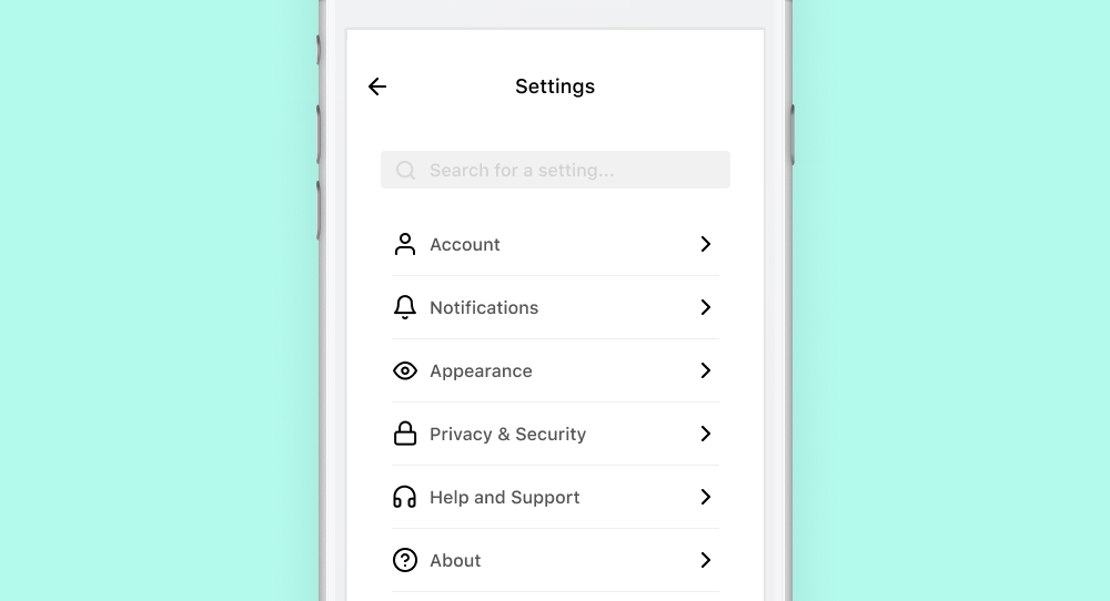
Initial Settings screen
The initial account settings screen on desktop is divided into two sections: Account and Notifications. This information architecture had to be considered when designing for mobile.

How might we provide visual hierarchy within mobile designs to help the user navigate between Account and Notifications settings?
In addition to hierarchy, and to provide a more consistent experience across platforms, I utilized feedback from the team and users to unify some of the conventions between iOS and Android. Another decision I made was to include the footer links on the settings page, to align with common mobile conventions.
- Include headings between each section of settings to help provide hierarchy and orient users
- Unify styling of action items within the settings list
- Provide consistent affordance via icons that help users understand what will happen when they tap
- Right facing chevrons to indicate a tap will bring the user one page deeper in the IA
- Launch link icons next to links to indicate that the user will open a link outside of the current application
Editing Address
Within the desktop layout, viewing and modifying address settings provides a form allowing users to make and save changes to these settings. The form was laid out to conserve space on the screen, and to also ensure inputs are sized to indicate the amount of information that is meant to be entered into them. In addition, form fields for City, Province and Postal code were grouped together to more closely connect this information and to conserve space on the page.

How might we display this form on mobile in such a way that it meets brand guidelines but also includes familiar conventions across Android and iOS?
To adhere to decisions made on the main Settings page, some conventions across iOS and Android were unified. However, due to user feedback, some conventions were designed divergently, to provide users with an experience they expect based on their device and operating system.

- Unified designs across iOS and Android for the title bar to include:
- A signifier for the page title to orient the user to their current location in the app
- Affordance for navigating back by tapping the 'left chevron' icon
- A signifier for saving settings via a button
- Utilized Android design conventions for form input styling and functionality to adhere to brand standards and provide a consistent experience
- Based on user feedback, opted to apply divergent design conventions between Android and iOS for including a signifier within focused inputs for clearing entered values
- Designed screen to allow users to visualize important information when keyboard is in the 'up' position
Notifications
On the desktop layout, viewing and modifying notifications settings provides a series of checkboxes, allowing the user to decide whether or not to receive certain notifications. In addition, it was important to provide the user with contextual information about what each notification setting means to aid in their decision.

How might we provide users with visual hierarchy on a mobile device, and ease the selection/deselection of desired notification settings?
Due to user feedback, some conventions were designed divergently, to provide users with an experience they expect based on their device and operating system. Wherever possible, designs for this settings screen were unified to reduce development time and unify app branding.
- Continued use of patterns and styling for title bars
- Signifier for page title to orient users to their location in the app
- Affordance for navigating back by tapping the 'left chevron' icon
- Removal of the 'Save' button in this instance. Based on user testing, users expect that switch toggles will automatically be saved
- Similar design convention for hierarchy and grouping of information
- Divergent styling of switch toggles between iOS and Android based on user feedback
- Addition of contextual subtitles for each item, to provide users with more context about the function of each action and related toggle switch
Summary
Collaborating closely with the Design and Development teams, this project involved a series of negotiations between:
- reducing development time by using the same design and functionality across operating systems and;
- ensuring designs adhered to expected operating system patterns based on user feedback
A number of compromises were reached in order to adhere to timelines. However, user feedback was integral in helping provide rationale to the development team for why a divergence was required.
Since my initial designs on this application, and my shift onto other projects the ability to set preferred language has been added to application settings.