eForm Add and Delete pages

What is this project about?
A design project spanning three weeks
Think Research has developed a WYSIWYG digital form creator to be used by internal stakeholders to build custom, digitally fillable forms based on their existing paper forms. The application uses technology that ingests a PDF with existing fillable fields and converts it to HTML format. The internal users are responsible for customizing these forms to capture data entered and allow clients to digitally sign these forms. Once HTML forms are filled and submitted, they are converted into another PDF for the client to archive or upload to their third-party systems.
Over time, the original eForm technology created larger and larger endpoint PDFs, which were too large for clients to upload to third party systems. A second form type, ‘eForm Lite’ was created using Google Cloud Platform to retain the original PDF and reduce file size greatly. However, this change in technology also required a change to how the fillable HTML forms are created. As this new workflow and WYSYWIG builder were developed our teams began to rebuild existing features from the eForm builder into the eForm Lite builder. The development teams built out the new form builder to bring parity to the build capabilities and features of the original eForm builder with the new technology.
The feature
The feature that we needed to rebuild, as a team, was the ability to replace pages in an existing form when a client requests a change to that form. Without this, our internal Document Developers would have to rebuild an entire form from scratch every time a client made a request for changes, including pages that the client never changed.
The constraints
- Resources: Development resources at this time included only 4 developers.
- Time: The need to reduce wasted work for internal Document Developers was very important to reduce the time wasted rebuilding forms from scratch and to ensure we could deliver on client requests in a timely manner.
- Technology: Due to the above constraints the ability to ‘replace pages’ was very unknown to developers and high risk. As a result, the team decided to start by developing the ability to Add pages and Delete pages. Used together, these two abilities could achieve the ability to replace certain pages in an existing form, therefore saving time on eForm Lite document development.
Understanding the current state
Documenting the current feature on the eForm builder
Replace or Add pages
Initial state
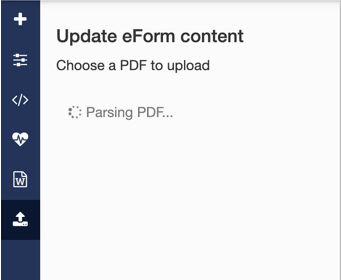
Displayed when the user clicks “Upload” icon from left navigation. This opens a panel that houses the first step: PDF upload.
User actions:
- Upload: Click the “Choose file” button to upload a fillable PDF form
- Cancel: Click the “Upload” icon in left nav to close the panel

PDF Upload and ingestion
Once a file is selected, the user is shown a localized state change that displays “Uploading PDF” and then “Parsing PDF”. “Parsing PDF” is the longest step, and includes the ingestion of the fillable PDF and conversion to JSON (HTML) that is placed into the editable eForm document.
Upload success - Replace page(s)
The uploaded form name and page count appears in a card at the top of the panel. The initial state shows the “Replace page(s)” tab selected.
User actions:
- Replace pages (overwrites existing pages in the FD document)
- Select pages in the document to overwrite
- Select pages from the uploaded PDF to overwrite with
I identified an opportunity to clarify the workflow, including labels and language used, but also that there may not be time within the current scope. This was slated as a future improvement and out of scope.

Upload success - Add page(s)
The uploaded form name and page count appears in a card at the top of the panel. The “Add page(s)” tab selected.
User actions:
- Add pages to the existing document
- After Start (at beginning of document)
- After specified page number (from 1 to 'total # of pages in the current document')

Upload failure
An error message is displayed if:
- The uploaded PDF is too large (over 5mb)
- The upload timed out
- The uploaded PDF contains a virus
I identified the opportunity to provide the user with more informative error text to help them understand why the upload failed.
User actions:
- Retry: User can click "Choose file" (retry by uploading another PDF)
- Cancel: Click “Upload" icon in left nav to close the panel

Delete Pages
This functionality is accessed via the action bar at the top of the UI, by clicking the ‘pages’ dropdown menu item. Within this dropdown are the “Add page” and “Delete this page” actions. “Add page” will add a blank page to the end of the document. “Delete this page” will delete the currently viewed page. When the page is deleted, the page number shown in the action bar will update to reflect the new page number.

Understanding user workflows
In order to understand how our users are working with the current solution, I sat down with two of our team’s Document Developers (User #1 and User #2); One experienced and one novice. I asked each of them to walk me through their process with the current eForm builder for replacing pages in a document or adding pages to a document.
Observations:
- The most frequent action when applying client changes to update an eForm is “Replace pages”
- “Add pages” is used, but less frequently than Replace pages. It is possible for a client to make changes to existing pages and also ask for pages to be added to the document
- "Add pages" from the main navigation is never used when building eForms
- “Delete pages” is used less frequently for eForms
- Uploaded PDFs often include only the pages from the PDF that need to be updated. This is done because it takes longer to ingest a PDF with more pages. Document Developers will extract only the updated pages into a separate PDF to upload, to speed the upload and ingestion step
- The current feature for deleting pages allows only to delete the currently viewed page. Document Developers often have to perform this action multiple times if they have to delete several pages from a document
- Upload and ingestion often takes a long time (60-90 seconds) when users have to replace 3 or more pages. Users often switch tasks and wait for this step to complete
User feedback regarding the current state
- Novice user did not notice the “Add pages” tab in the panel for quite some time due to the subtle nature and lack of contrast of its styling
- Deleting pages one at a time was noted to be a tedious action
Considerations for feature design
I was able to collaborate with developers and the product owner during the research phase to better understand the capabilities and constraints of the tech that would be used to build this feature. The developers' active participation during this phase was integral to me clearly understanding what could and could not be done, and greatly reduced the amount of wasted work I may have done, had I not worked with them from the start. Shout out to the developers for all their help!!!
Technical considerations
- In order to group multiple steps into a single transaction and reduce conflicts or failures when sending changes made in the builder up to the PDF on Google Cloud, the workflow needed modification:
- Step 1: Upload (Check for viruses and gets number of pages)
-
Step 2: Add pages
- Get JSON from uploaded, fillable PDF (single source of truth to generate fillable fields on eForm)
- Delete fillable fields from PDF
- Stitch uploaded PDF pages onto the PDF on Google Cloud to create a single, updated PDF
- Add pages: The user can select the pages from the uploaded PDF they want to add to the document and select where they would like to add them. Upon clicking "Add pages", a wait time will occur before the PDF processing is complete. A spinner or progress indicator should show at this point:
- Delete pages: The user should be able to select one or more ranges of pages to delete from the current document. Upon clicking "Delete pages", a wait time will occur. A spinner or progress indicator should show at this point.
Possible points of failure:
- Upon uploading a PDF:
- Uploaded PDF has a virus. User must upload a new PDF
- Uploaded PDF exceeds 5mb. User must upload a smaller PDF
- Upon clicking “Add pages” to insert uploaded pages into existing document:
- Uploaded PDF is corrupted. User must upload a new PDF
- Upload to Google Cloud storage did not succeed. User must retry Adding pages
Updated workflow
- Due to technical, time and resourcing constraints it was agreed with the team that the workflow to “Replace pages” would not be developed. Instead, users will have to upload pages with changes, and then delete the old pages from the document
- Informs the need to house “Add pages” and “Delete pages” together in the same area of the UI, to streamline this multi-step process for users
- In order to Add pages, the process steps now include Upload PDF and Process PDF+Send to GCP. Development teams suggested that the upload PDF step be a single step, and the remaining processes all be included together in a second step
- The progress step should be displayed in a separate step after PDF upload, upon clicking “Add pages”
- Delete pages will now take some time, as data needs to be sent to the PDF housed on Google Cloud
- Informs the need for a progress indicator for deleting pages
- It is important to reduce complexity and to eliminate conflicts that may arise if users make a change to the form fields in the working document during Add or Delete pages steps
- The ability to edit or modify the working document in the WYSIWYG editor should be locked out during these processes
Workflow diagram

Ideation
Navigation: Two ways to open the panel
I utilized the current convention, where Add pages and Delete pages are housed in the side panel. In this version, the user can access the side panel via the existing sidebar button or via the action bar ‘Pages’ dropdown.

Pros:
- Allows users to access this functionality in multiple ways, using their current knowledge of the product and muscle memory to access the feature as they choose
Cons:
- May be confusing to some users if they are not used to accessing Add pages from here
- May cause confusion for onboarding new users that there are two ways to access these features
Workflow 1: Localized workflow within the existing dropdown
I introduced a completely new pattern for this version which allows the users to access the entire Add pages or Delete pages workflow in a localized state via the action bar ‘Pages’ dropdown.

Pros:
- Less screen real estate used for this workflow than the panel
Cons:
- Users may take some time to get used to the new pattern and it may not be obvious how to use it at first
- Popout panel overlaps document and may obscure view
- Increased scope - Cannot reuse already developed components, must build new
Workflow 2: Panel with tabs
Utilizing the current convention, where tabs are utilized to house the Add pages and Delete pages workflows.

Pros:
- May reduce cognitive load, as users are familiar with this convention already
- Ability to reuse code from already developed UI
Cons:
- Users cannot see both Add and Delete workflows at the same time
Workflow 3: Panel with Vertical accordions
I reused a pattern from the WYSIWYG drag and drop editor, and added Accordions that open vertically to show the Add and Delete workflows. The Add/Delete flows are housed in separate accordions, but can be viewed simultaneously as needed.

Pros:
- May reduce cognitive load, as users are familiar with the use of accordions within the application
- Reduces the need for an additional ‘tab’ convention that is not used anywhere else in the application
Cons:
- Increased scope - Cannot reuse already developed components, must build new (but only some!)
Workflow 4: Panel with Accordion and Nested steps
Utilizing the same accordion pattern used in the WYSIWYG editor, but modifying it to show a single workflow at a time via nested panel steps.

Pros:
- User can focus on a single step at a time
Cons:
- Users cannot see both Add and Delete workflows at the same time
- Increased scope - Can reuse already developed components, but must modify existing and add new
User Testing
Users

User #1
This user has intermediate experience with the WYSIWYG builder. They have created eForms and other document types using this builder but are newer to creating eForms Lite.
User #2
This is an experienced user of the WYSYWIG builder who has created many eForms, eForms Lite and other document types.

User #3
This user has never created an eForm with the WYSYWIG builder. They have seen the app before, but have not used the existing feature.
Assumptions to test
- Users will access Add/Delete pages panel via the sidebar button rather than the action bar ‘Pages’ menu
- Users understand how to walk through the newly introduced localized dropdown flow for adding or deleting pages
- Users can find the appropriate navigation to go back to a previous step for all workflows
Questions to resolve with Users
- Was there anything users found confusing about any of the flows?
- What did users like about each flow?
- Which version did users like best, and why?
- Would users prefer Add/Delete pages to be in the same place, or prefer to keep them in separate menus, like they are in the current states?
- If users prefer Add/Delete pages in the same area, which action would they prefer to appear first? Add pages or Delete pages?
- Is it helpful to have Add/Delete in both the nav bar and the side panel?
User Testing Tools
Maze

Maze is a user testing platform that turns prototypes into actionable insights from users.
InVision click through prototypes can be imported as a means for testing path-based assumptions and to understand where users click, misclick or abandon expected paths for each prototype.
I set up Maze "missions" to test my assumptions for each prototype, and reviewed and synthesized insights to inform the final designs.
InVision Prototype

InVision prototyping transforms static designs into fully interactive click through prototypes.
I set up a click through prototype for each of ideated version, and curated them to test the assumptions for each.
After Mazes were run, I sat down with each user to walk through the entire workflow for each prototype on InVision and gain additional feedback about each possible flow.
User testing results
Maze data
Mission: Explore adding and Deleting pages
Testing expected paths to access Add/Delete pages
Assumptions:
- Users familiar with the application will access this via the sidebar.
- Unfamiliar users will look for a signifier (label) and may use the “Pages” dropdown in the navigation.
Result:
1 user clicked sidebar, 2 users clicked “Pages”
Note:
After clicking the Pages menu, when User 3 was asked about his decision, this user noted that they were going to click the sidebar but second guessed themselves. Noted that they would likely have used the sidebar because they are used to accessing Upload here

Mission: Finding your way back
Testing localized dropdown flow
Assumptions:
Users will click the ‘Back’ at the top of the popout to navigate back and access the ‘Add Pages’ section
Result:
- 1 user did not make it to this path
- 1 user clicked the Back button in the popout
- 1 user clicked the ‘Pages’ Dropdown
Observations: If this version is used, this data informs the need to have ‘Pages’ dropdown button and the ‘Back’ button in the popout behave the same way (reverts to dropdown initial state with add/delete).

Mission: Navigating between flows
Testing Accordion flow
Assumptions:
- Users will click the ‘Delete pages’ accordion to access this area when the ‘Add pages’ accordion is open.
Result:
All three users ultimately found the correct path. However 1 user tried clicking the ‘Add pages’ accordion to close it, first
Observations:
Users familiar with this convention were able to quickly navigate between Add and Delete pages workflows via Accordions.

Mission: Navigating between flows
Testing Accordion flow with nested panels
Assumptions:
Users will click the ‘Update eForm Content with back button’ at the top to go back to the Accordion view
Result:
3 users clicked the correct area
Observations:
One user clicked the text next to the icon. Informs the need to have this entire title be clickable

User Interview results
Notable questions and answers
- Was there anything you found confusing about the flows?
- User #1: Wasn’t sure about the localized dropdown because they are afraid if they clicks out they will lose all their work or click something else by mistake
- User #2: "The one where you click the top bar was interesting." They found it easy to use, but weren't sure if they should use the sidebar icon or not. User didn’t like that the dropdown localized flow overlapped the document.
- User #3: No
- Which version did you prefer and why?
-
User #1: Preferred the accordions because they are used to this in the drag and drop WYSIWYG menu. “It’s more obvious which step I’m on” (between add/delete). User was familiar with the accordion convention and knows what to expect.
-
User #2: Initially they preferred the localized dropdown because it was an interesting workflow and took up less space, but upon reviewing all versions - they changed their preference to the Accordion with nested panels. Also liked the vertically opening accordions and noted, “It’s a familiar convention to use the accordions”. This user also liked that they could focus on a single task of adding pages or deleting pages, rather than seeing both
- User #3: Preferred the localized dropdown menu. Was concerned that the panel might overlap the document on smaller screens.
Observations
-
Both of the more experienced users instinctively clicked the sidebar icon to access Add/Delete pages, and did not expect to find these actions in the top navigation bar
-
Both of the more experienced users users both noted ““If we can’t have ‘replace pages’ it makes sense to have Add and Delete in the same place because we will use them together, often””
-
All users liked the Accordion flow with nested panels that included a new pattern for navigating back to a previous step. All users understood this convention well.
-
During Maze missions, there were no significant click delays. This indicated there was not a lot of thinking to do and the users understood next steps for each flow
-
More experienced users did not see the need to have two ways to access the panel. They noted that they would prefer just the sidebar action, which they commonly use to access this panel
-
All users noted that it made sense to show “Add pages” first in the UI and “Delete pages” second
Now what?
After synthesizing all of the user interviews and clickthrough data, I decided upon the following approach for the designs:
-
Continue with current convention to open panel from sidebar, where Add/Delete actions will be housed
-
Create a complete set of mockups with all success and error states using Accordion with nested panels convention
-
Remove “Pages” dropdown from main nav